
Friday, July 19, 2013 From rOpenSci (https://ropensci.org/blog/2013/07/19/rwbclimate-maps/). Except where otherwise noted, content on this site is licensed under the CC-BY license.
A recent video on the PBS Ideas Channel posited that the discovery of climate change is humanities greatest scientific achievement. It took synthesizing generations of data from thousands of scientists, hundreds of thousands (if not more) of hours of computer time to run models at institutions all over the world. But how can the individual researcher get their hands of some this data? Right now the World Bank provides access to global circulation model (GCM) output from between 1900 and 2100 in 20 year intervals via their climate data api. Using our new package rWBclimate you can access model output from 15 different GCM’s, ensemble data from all GCM’s aggregated, and historical climate data. This data is available at two different spatial scales, individual countries or watershed basins. On top of access to all this data, the API provides a way to download KML definitions for each corresponding spatial element (country or basin). This means with our package it’s easy to download climate data and create maps of any of the thousands of datapoints you have access to via the API.
🔗 Install rWBclimate
# install_github('rWBclimate', 'ropensci')
library(rWBclimate)
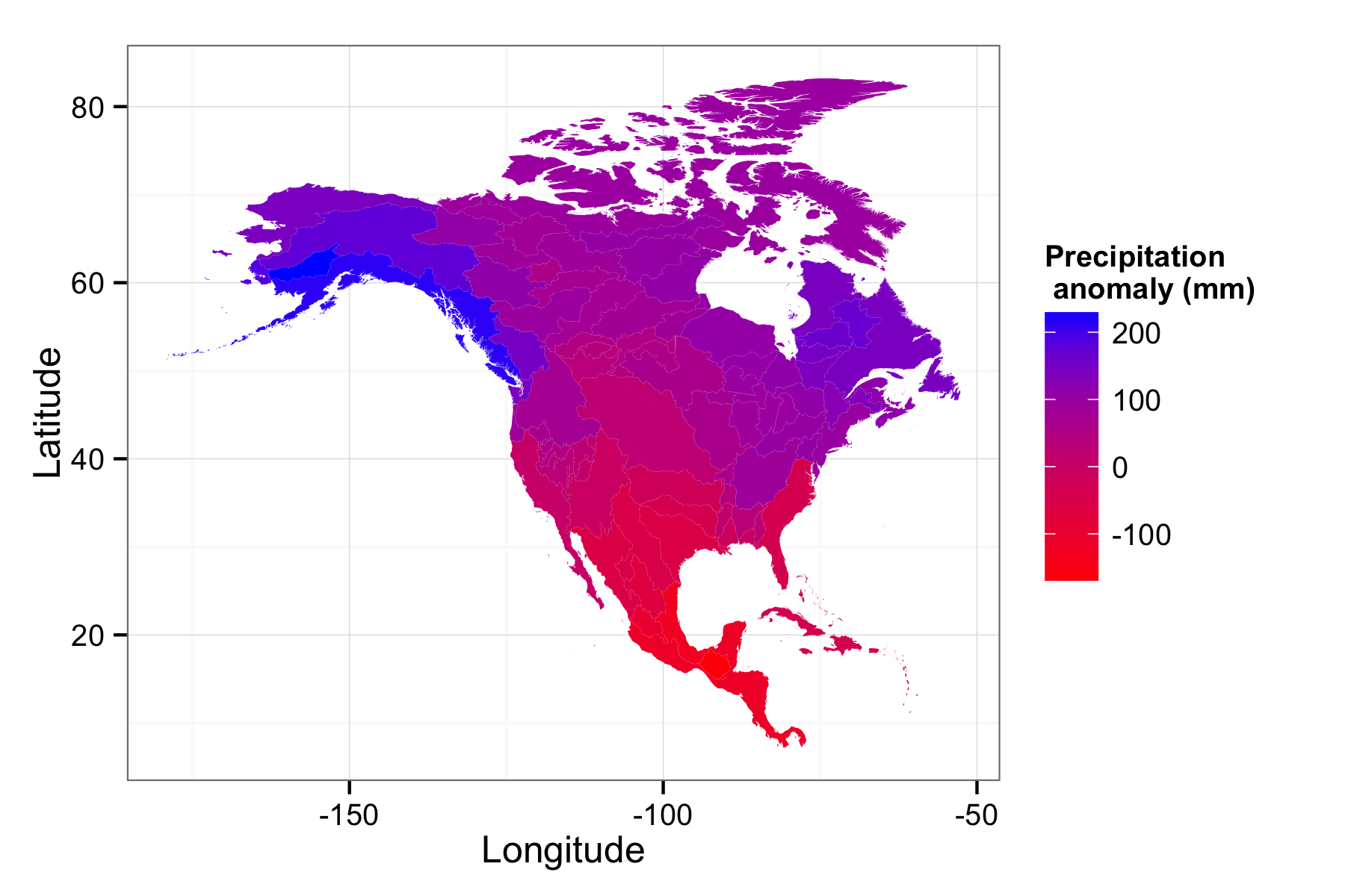
🔗 Map of North American precipitation anomalies
Aside from access to both temperature and preciptation data, you can download anomaly data, showing the change from some time period and a control period of 1961-2009. Let’s create a precipitation anomaly map to see how much change there will be across North America. The first thing we’ll need to do is download the data and subset it so we have one piece of spatial information per KML polygon. We’ll be using examples with preloaded basin ID’s, in this case NoAm_basin. However you can download data with a vector of numbers for basins or countries using three letter ISO country codes
# Download data for all basins in North America in the 2080-2100 period
prp.dat <- get_ensemble_precip(NoAm_basin,"annualanom",2080,2100)

#subset the data to the 50th percentile
prp.dat <- subset(prp.dat, prp.dat$scenario == "a2" & prp.dat$percentile == 50)
Now we should have all the data we need, we need to download the KML files to map. rWBclimate locally stores KML files in a directory you specify until they are deleted. You’ll need to set kmlpath in the options as follows: options(kmlpath="/Users/edmundhart/kmltemp") KML files can be large so when first downloading it can take some time to create a map dataframe.
options(kmlpath="/Users/edmundhart/kmltemp")
#First create a mapable data frame with the same basin ID's that were used to download data.
prp.map <- create_map_df(NoAm_basin)
Now that you have your data as well as your dataframe of polygons we just need to use one last function to create a map. You have two options with this function. It can return a dataframe that you can map yourself, or a ggplot2 map that can be modified as you see fit like in this example.
pranom.map <- climate_map(prp.map,prp.dat)
pranom.map <- pranom.map + scale_fill_continuous("Precipitation \n anomaly (mm)", low="Red",high = "Blue")+ylab("Latitude")+xlab("Longitude") + theme_bw()
Here you can see that northern latitudes are expected to get much rainier while as you move closer to the equator the climate will become drier.
🔗 Creating a global temperature map
You could also create custom global maps. Let’s put it all together and make a world map at the basin level for temperature anomaly. This will take a bit of time to run beacuse you’re downloading 438 kml files.
wtemp.dat <- get_ensemble_temp(1:468,"annualanom",2080,2100)
wtemp.dat <- subset(wtemp.dat, wtemp.dat$scenario == "a2" & wtemp.dat$percentile == 50)
wtemp.map.df <- create_map_df(1:468)
wtemp.map <- climate_map(wtemp.map.df,wtemp.dat)

wtemp.map <- wtemp.map + scale_fill_continuous("Temperature \n anomaly", low="Yellow",high = "red")+ylab("Latitude")+xlab("Longitude") + theme_bw()
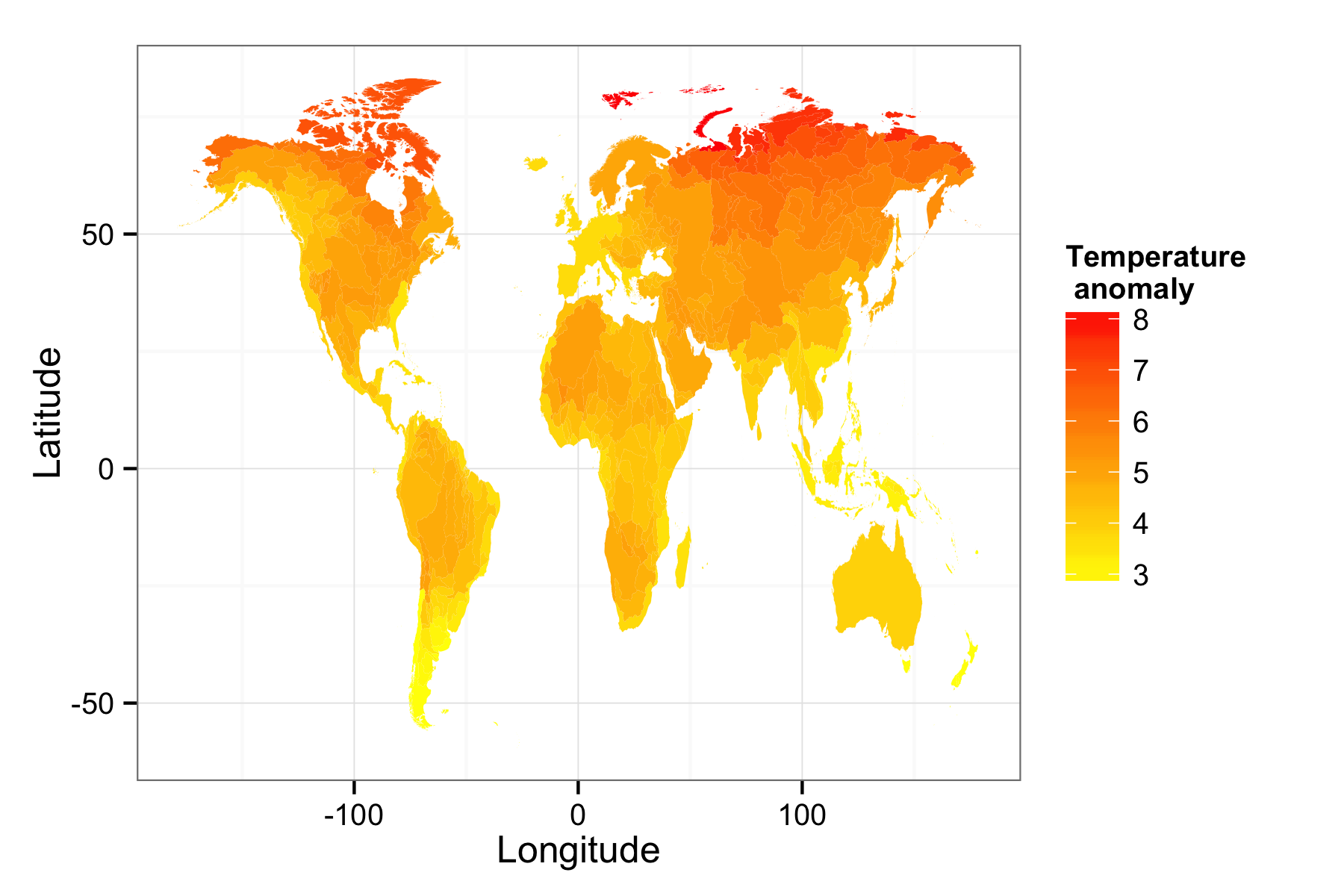
This creates a world map of temperature anomalies. There’s a tremendous amount of data available that you can map and and plot available from the climate data api, check out the vignette up on the github webpage for a full tutorial.
Filed under
Suggest an edit
Open a pull request
