Sunday, August 18, 2013 From rOpenSci (https://ropensci.org/blog/2013/08/18/sciordata/). Except where otherwise noted, content on this site is licensed under the CC-BY license.
I recently attended ScienceOnline Climate, a conference in Washington, D.C. at AAAS. You may have heard of the ScienceOnline annual meeting in North Carolina - this was one of their topical meetings focused on Climate Change. I moderated a session on working with data from the web in R, focusing on climate data. Search Twitter for #scioClimate for tweets from the conference, and #sciordata for tweets from the session I ran. The following is an abbreviated demo of what I did in the workshop showing some of what you can do with climate data in R using our packages.
Before digging in, why would you want to get climate data programatically vs. via pushing buttons in a browser? Learning a programming language can take some time - we all already know how to use browsers. So why?! First, getting data programatically, especially in R (or Python), allows you to then easily do other stuff, like manipulate data, visualize, and analyze data. Second, if you do your work programatically, you and others can reproduce, and extend, the work you did with little extra effort. Third, programatically getting data makes tasks that are repetitive and slow, fast and easy - you can’t easily automate button clicks in a browser. Fourth, you can combine code with writing to make your entire workflow reproducible, whether it’s notes, a blog post, or even a research article.
🔗 Interactive visualizations in R
Let’s start off with something shiny. The majority of time I make static visualizations, which are great for me to look at during analyses, and for publications of research findings in PDFs. However, static visualizations don’t take advantage of the interactive nature of the web. Ramnath Vaidyanathan has developed an R package, rCharts, to generate dynamic Javascript visualizations directly from R that can be used interactively in a browser. Here is an example visualizing a dataset that comes with R.
library(devtools)
install_github("rCharts", "ramnathv")
library(rCharts)

# Load a data set
hair_eye_male <- subset(as.data.frame(HairEyeColor), Sex == "Male")

# Make a javascript plot object
n1 <- nPlot(Freq ~ Hair, group = "Eye", data = hair_eye_male, type = "multiBarChart")

# Visualize
n1$show(cdn = TRUE)
If you like you can take the source code from the visualization (right click on select View Page Source) and put it in your html files, and you’re good to go (as long as you have dependencies, etc.) - quicker than learning d3 and company from scratch, eh. This is a super simple example, but you can imagine the possibilities.
🔗 The data itself
🔗 install packages
library(devtools)
install_github("govdat", "sckott")
install_github("rnoaa", "ropensci")
install_github("rWBclimate", "ropensci")
install_github("rnpn", "ropensci")
🔗 Politicians talk - Sunlight Foundation listens
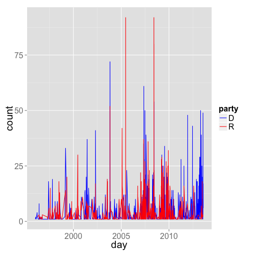
Look at mentions of the phrase “climate change” in congress, using the govdat package
library(govdat)
library(ggplot2)

# Get mentions of climate change from Democrats
dat_d <- sll_cw_timeseries(phrase = "climate change", party = "D")

# Add a column that says this is data from deomcrats
dat_d$party <- rep("D", nrow(dat_d))

# Get mentions of climate change from Democrats
dat_r <- sll_cw_timeseries(phrase = "climate change", party = "R")

# Add a column that says this is data from republicans
dat_r$party <- rep("R", nrow(dat_r))

# Put two tables together
dat_both <- rbind(dat_d, dat_r)

# Plot data
ggplot(dat_both, aes(day, count, colour = party)) + theme_grey(base_size = 20) +
    geom_line() + scale_colour_manual(values = c("blue", "red"))

gistr map
🔗 NOAA climate data, using the rnoaa package
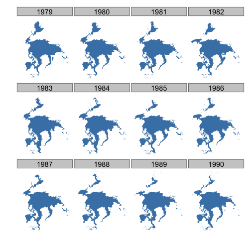
Map sea ice for 12 years, for April only, for the North pole
library(rnoaa)
library(scales)
library(ggplot2)
library(doMC)
library(plyr)

# Get URLs for data
urls <- seaiceeurls(mo = "Apr", pole = "N")[1:12]

# Download sea ice data
registerDoMC(cores = 4)
out <- llply(urls, noaa_seaice, storepath = "~/seaicedata", .parallel = TRUE)

# Name elements of list
names(out) <- seq(1979, 1990, 1)

# Make a data.frame
df <- ldply(out)

# Plot data
ggplot(df, aes(long, lat, group = group)) + geom_polygon(fill = "steelblue") +
    theme_ice() + facet_wrap(~.id)

gistr map
🔗 World Bank climate data, using the rWBclimate package
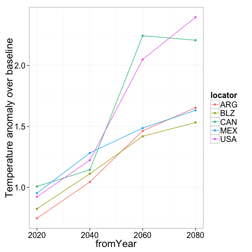
Plotting annual data for different countries
Data can be extracted from countries or basins submitted as vectors. Here we will plot the expected temperature anomaly for each 20 year period over a baseline control period of 1961-2000. These countries chosen span the north to south pole. It’s clear from the plot that the northern most countries (US and Canada) have the biggest anomaly, and Belize, the most equatorial country, has the smallest anomaly.
library(rWBclimate)

# Search for data
country.list <- c("CAN", "USA", "MEX", "BLZ", "ARG")
country.dat <- get_model_temp(country.list, "annualanom", 2010, 2100)

# Subset data to one specific model
country.dat.bcc <- country.dat[country.dat$gcm == "bccr_bcm2_0", ]

# Exclude A2 scenario
country.dat.bcc <- subset(country.dat.bcc, country.dat.bcc$scenario != "a2")

# Plot data
ggplot(country.dat.bcc, aes(x = fromYear, y = data, group = locator, colour = locator)) +
    geom_point() + geom_path() + ylab("Temperature anomaly over baseline") +
    theme_bw(base_size = 20)

gistr map
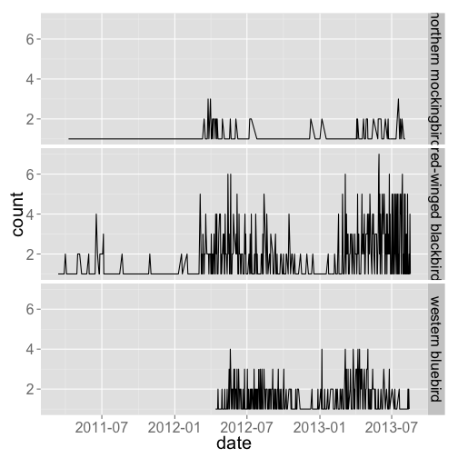
🔗 Phenology data from the USA National Phenology Network, using rnpn
library(rnpn)

# Lookup names
temp <- lookup_names(name = "bird", type = "common")
comnames <- temp[temp$species_id %in% c(357, 359, 1108), "common_name"]

# Get some data
out <- getobsspbyday(speciesid = c(357, 359, 1108), startdate = "2010-04-01",
    enddate = "2013-09-31")
names(out) <- comnames
df <- ldply(out)
df$date <- as.Date(df$date)

# Visualize data
library(ggplot2)
ggplot(df, aes(date, count)) + geom_line() + theme_grey(base_size = 20) + facet_grid(.id ~
    .)

gistr map
🔗 Feedback and new climate data sources
Do use the above pacakges (govdat, rnoaa, rWBclimate, and rnpn) to get climate data, and get in touch with bug reports, and feature requests.
Surely there are other sources of climate data out there that you want to use in R, right? Let us know what else you want to use. Better yet, if you can sling some R code, start writing your own package to interact with a source of climate data on the web - we can lend a hand.

