
Tuesday, February 21, 2017 From rOpenSci (https://ropensci.org/blog/2017/02/21/ropenaq/). Except where otherwise noted, content on this site is licensed under the CC-BY license.
Do you fancy open data, R, and breathing? Then you might be interested in ropenaq which provides access to open air quality data via OpenAQ! Also note that in French, R and air are homophones, therefore we French speakers can make puns like the one in the title. Please re-read it with a French accent and don’t judge me.
In this post I’ll motivate the existence of the package, then show you the basics of its use, and finally show off with some pretty figures. You can skip any part but if I were you I wouldn’t!
🔗 Discovering OpenAQ and rOpenSci
I work as a data manager and statistician for an epidemiology project called CHAI for Cardio-vascular health effects of air pollution in Telangana, India. We have generated quite a lot of data of our own, including ambient air quality monitoring at three fixed sites in rural Telangana for one year. Being able to compare these numbers with longer-term measures in the closest city, Hyderabad, was something that probably would be useful at some point, so besides data cleaning, I had a look at other data sources.
However, in that part of the world, you don’t get much air quality data, and even less open and easily accessible air quality data. One pretty easily gets data from the US consulate in Hyderabad (well, easily thanks to tabulizer, since parts of the data are pdf!). But going on the website of the Indian Central Pollution Control Board I embarked on a kind of scavenger hunt clicking around which felt quite frustrating. This also happens with websites from other countries, with a different scavenger hunt for each website. Sure you learn about tabulizer, rSelenium, seleniumPipes and other awesome – often rOpenSci-branded – packages along the way but it just doesn’t feel right to have to spend so much time doing this!
At the end of 2015, during a symposium about the future of environmental epidemiology, my boss mentioned OpenAQ, a platform aggregating and sharing open air quality data from official sources around the world. A bit after that, I found myself looking at the API documentation and got really excited. I contacted OpenAQ founders and asked them whether a R package already existed, and Christa Hasenkopf told me I could open an issue about it which I had zero intention of doing, I wanted to make it happen right now! So I started writing the package.
At the same period of my life, a bit earlier, on one week-end I had been googling ways to download scientific literature metadata in R because of a discussion I’d had with my husband. Doing that I had discovered the website of rOpenSci (see all the literature access packages here) and had really thought it looked like an awesome project, I even saw there was an onboarding system where you could submit your package and make it part of the suite… I had more urgent things to do on that week-end, like finishing to write my PhD thesis, but the idea stuck with me.
So really soon after writing the first version of ropenaq, I submitted my package to rOpenSci! I was a bit scared, I had to google parts of the words of the guidelines, like “continuous integration”, but there are many resources out there and from all rOpenSci reviews I’ve read you can ask for help at any point of the process.
I received the reviews of Andy Teucher and Andrew MacDonald a few weeks later. Their comments were as nice as they were useful! You can read the review here and see what I mean by nice and useful! I improved ropenaq and really dug the rOpenSci review process. Not only did my package get better, but my R skills and knowledge of best practice also improved, which is useful every day of my life as a data manager and statistician. And I became a contributor of both OpenAQ and rOpenSci, two projects whose goals resonated with me!
So end of the story, now let’s move to the more interesting stuff, what can you do with ropenaq? Download all the data from OpenAQ! Well not all the data in one go, if you really wanted to do that you should look at their daily data dumps or contact them, but here’s how you would deal with the query “How are PM2.5 values in Hyderabad?”. OpenAQ has data for 7 pollutants: PM2.5 (particles smaller than 2.5μm), PM10 (particles smaller than 10μm), SO2 (sulfur dioxide), NO2 (nitrogen dioxide), O3 (ozone), CO (carbon monoxide), BC (black carbon). All of them are bad for human health with effects than can be revealed in the short or long term. In the whole post I’ll only show examples with PM2.5, but other pollutants can be as interesting.
🔗
Getting data via ropenaq
🔗 Install the package
Install the package with:
install.packages("ropenaq")
Or install the development version using devtools with:
library("devtools")
install_github("ropensci/ropenaq")
Currently the development version, 1.0.4 implements OpenAQ new limit per API call of 10,000, while the CRAN version, 1.0.3, only allows to return 1,000 lines per API call. The development version should soon be submitted to CRAN.
🔗 Find the air quality stations with available data
The package contains three functions that are useful to find the stations at which there is data: aq_countries, aq_cities and aq_locations.
So say I’m looking for Indian data, I could choose to first check there’s data for India.
library("ropenaq")
library("dplyr")
import::from(dplyr, filter)
countries <- aq_countries()
filter(countries, name == "India")
## # A tibble: 1 × 5
##    name  code cities locations   count
##   <chr> <chr>  <int>     <int>   <int>
## 1 India    IN     93        93 2766369
In the other functions of ropenaq, what you’ll need to use for saying you want data for India is the country code, IN. By the way if you ever need to convert country names and codes, have a look at the countrycode package.
Now we could look for cities for which there is data in India.
in_cities <- aq_cities(country = "IN")
filter(in_cities, city == "Hyderabad")
## # A tibble: 1 × 5
##        city country locations  count   cityURL
##       <chr>   <chr>     <int>  <int>     <chr>
## 1 Hyderabad      IN        10 159191 Hyderabad
In ropenaq other functions, what you’ll use for the city is its cityURL. Now we can have a look at all stations for Hyderabad.
aq_locations(city = "Hyderabad") %>%
  knitr::kable()
| location | pm25 | pm10 | no2 | so2 | o3 | co | bc | lastUpdated | firstUpdated |
|---|---|---|---|---|---|---|---|---|---|
| Bollaram Industrial Area | TRUE | TRUE | TRUE | TRUE | FALSE | TRUE | FALSE | 2017-02-17 05:15:00 | 2017-02-16 07:15:00 |
| Bollaram Industrial Area, Hyderabad - TSPCB | TRUE | TRUE | TRUE | TRUE | FALSE | TRUE | FALSE | 2017-02-20 19:45:00 | 2017-02-17 05:45:00 |
| ICRISAT Patancheru | TRUE | TRUE | TRUE | TRUE | TRUE | TRUE | FALSE | 2017-02-17 05:30:00 | 2017-02-15 18:30:00 |
| ICRISAT Patancheru, Hyderabad - TSPCB | TRUE | TRUE | TRUE | TRUE | TRUE | TRUE | FALSE | 2017-02-20 19:30:00 | 2017-02-17 05:30:00 |
| IDA Pashamylaram,Hyderabad | TRUE | FALSE | TRUE | TRUE | TRUE | TRUE | FALSE | 2016-09-20 09:45:00 | 2016-09-20 04:45:00 |
| IDA Pashamylaram, Hyderabad - TSPCB | TRUE | TRUE | TRUE | TRUE | TRUE | TRUE | FALSE | 2017-02-20 19:30:00 | 2016-09-20 10:15:00 |
| Sanathnagar - Hyderabad - TSPCB | TRUE | FALSE | FALSE | FALSE | TRUE | TRUE | FALSE | 2017-02-20 19:30:00 | 2016-03-22 09:50:00 |
| TSPCBPashamylaram | TRUE | FALSE | TRUE | TRUE | TRUE | TRUE | FALSE | 2016-09-20 04:45:00 | 2016-09-18 18:30:00 |
| US Diplomatic Post: Hyderabad | TRUE | FALSE | FALSE | FALSE | FALSE | FALSE | FALSE | 2017-02-20 19:30:00 | 2015-12-11 21:30:00 |
| ZooPark | TRUE | TRUE | TRUE | TRUE | TRUE | TRUE | FALSE | 2017-02-20 19:15:00 | 2016-03-21 18:30:00 |
In this table you see the parameters available for each station, and the dates for which you can get data. One could also directly filter stations with, say, PM2.5 information:
aq_locations(city = "Hyderabad", parameter = "pm25")
## # A tibble: 10 × 19
##                                       location      city country count
##                                          <chr>     <chr>   <chr> <int>
## 1                     Bollaram Industrial Area Hyderabad      IN     5
## 2  Bollaram Industrial Area, Hyderabad - TSPCB Hyderabad      IN   151
## 3                           ICRISAT Patancheru Hyderabad      IN    38
## 4        ICRISAT Patancheru, Hyderabad - TSPCB Hyderabad      IN   151
## 5                   IDA Pashamylaram,Hyderabad Hyderabad      IN    11
## 6          IDA Pashamylaram, Hyderabad - TSPCB Hyderabad      IN  6694
## 7              Sanathnagar - Hyderabad - TSPCB Hyderabad      IN    74
## 8                            TSPCBPashamylaram Hyderabad      IN    35
## 9                US Diplomatic Post: Hyderabad Hyderabad      IN 10305
## 10                                     ZooPark Hyderabad      IN 13674
## # ... with 15 more variables: sourceNames <list>, lastUpdated <dttm>,
## #   firstUpdated <dttm>, sourceName <chr>, latitude <dbl>,
## #   longitude <dbl>, pm25 <lgl>, pm10 <lgl>, no2 <lgl>, so2 <lgl>,
## #   o3 <lgl>, co <lgl>, bc <lgl>, cityURL <chr>, locationURL <chr>
I do agree that the workflow that I’ve just presented is a bit tedious, but I really wanted you to know these three functions and to see how many countries/cities are represented. But actually things can be easier! The aq_measurements function I’m about to present you has a longitude, latitude and radius arguments allowing you to make a query directly inside a circle of your choice on the Earth’s surface! So if you have, for instance, names of cities in German, you don’t need to worry about their English names, just use your favorite geocoding package (may I suggest opencage?) and you’ll be good to go.
🔗 Get air quality data!
For getting measurements themselves, you can either use aq_latest or aq_measurements. aq_latest only gives you the latest measurements for a given place, aq_measurements gives all the measurements for a given place, and time period if you indicate one, this up to 10,000 data points per page. So if you make a query for a station with loads of data, you’ll have to loop or more elegantly/modernly map over pages. Don’t worry, ropenaq helps you know just how many pages there are. Say I want all PM2.5 data for Hyderabad…
# find how many measurements there are
first_test <- aq_measurements(city = "Hyderabad",
                              date_from = "2016-01-01",
                              date_to = "2016-12-31",
                              parameter = "pm25")
count <- attr(first_test, "meta")$found
print(count)
## [1] 24685
library("purrr")

# map queries over all pages
allthedata <- (1:ceiling(count/10000)) %>%
  purrr::map(function(page){
    aq_measurements(city = "Hyderabad",
                   date_from = "2016-01-01",
                   date_to = "2016-12-31",
                   parameter = "pm25",
                   page = page,
                   limit = 10000)
    }) %>%
  bind_rows()

allthedata
## # A tibble: 24,685 × 12
##                               location parameter value  unit country
##                                  <chr>     <chr> <dbl> <chr>   <chr>
## 1  IDA Pashamylaram, Hyderabad - TSPCB      pm25  56.0 µg/m³      IN
## 2                              ZooPark      pm25  56.0 µg/m³      IN
## 3        US Diplomatic Post: Hyderabad      pm25 158.6 µg/m³      IN
## 4  IDA Pashamylaram, Hyderabad - TSPCB      pm25  56.0 µg/m³      IN
## 5                              ZooPark      pm25  56.0 µg/m³      IN
## 6  IDA Pashamylaram, Hyderabad - TSPCB      pm25  56.0 µg/m³      IN
## 7                              ZooPark      pm25  56.0 µg/m³      IN
## 8  IDA Pashamylaram, Hyderabad - TSPCB      pm25  56.0 µg/m³      IN
## 9        US Diplomatic Post: Hyderabad      pm25 148.8 µg/m³      IN
## 10                             ZooPark      pm25  56.0 µg/m³      IN
## # ... with 24,675 more rows, and 7 more variables: city <chr>,
## #   dateUTC <dttm>, dateLocal <dttm>, latitude <dbl>, longitude <dbl>,
## #   cityURL <chr>, locationURL <chr>
Yeah! We got the data! And now we can make a plot! Since all ropenaq functions return tidy data.frames, you can use them with any of your favourite plotting libraries. Mine are ggplot2 coupled with viridis.
I’ll filter out the negative values, which are actually invalid values, because the original data source returns “-999” instead of NA and OpenAQ doesn’t make any change to the original data.
library("ggplot2")
library("viridis")
allthedata %>%
  filter(value != - 999) %>%
  group_by(day = as.Date(dateLocal), location) %>%
  filter(n() > 0) %>%
  summarize(average = mean(value)) %>%
ggplot() +
  geom_line(aes(x = day, y = average, col = location)) +
  facet_grid(location ~ .) +
  geom_hline(yintercept = 25) +
  scale_color_viridis(discrete = TRUE) +
  theme(legend.position = "none",
        strip.text.y = element_text(angle=0))+
  ylab(expression(paste("Average daily PM2.5 concentration (", mu, "g/",m^3,")"))) +
  xlab("Time (days)")
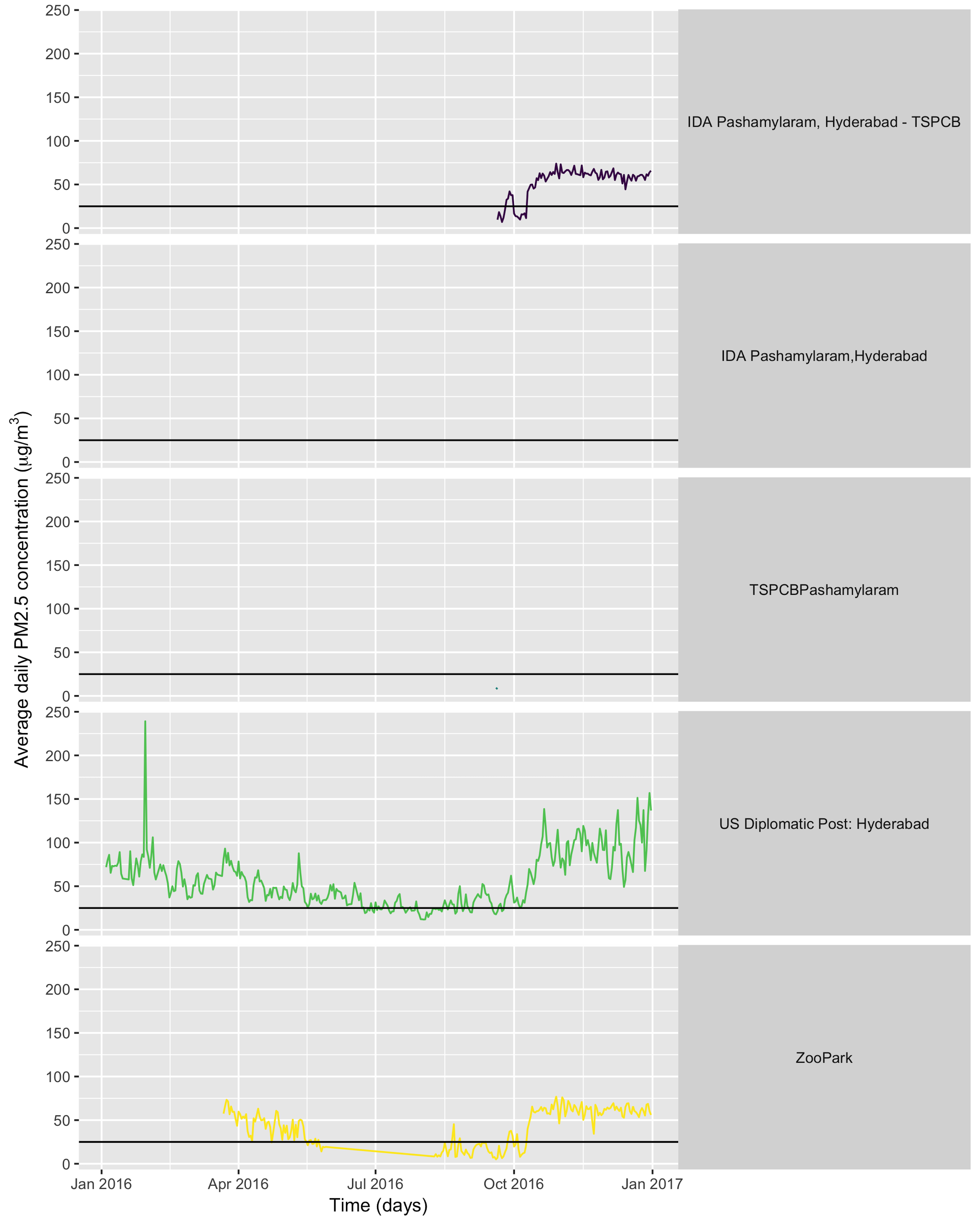
What can we conclude from looking at this graph? One point is that the WHO daily limit of 25μg/m3, indicated by the black horizontal line on the plot, is very often exceeded. Another point is that some stations produce so little data that we don’t even get a curve for them (note that in some cases gap in the data can be due to an OpenAQ issue rather than a provider issue). Both points can be interesting for fighting air pollution: having proof that the air is unhealthy might help trigger action against air pollution; and knowing the devices for measuring it were broken or that data wasn’t communicated is something one can complain about to official authorities.
Currently OpenAQ doesn’t have all the data sources available in the world, nor all the existing historical data. But the number of sources is constantly increasing thanks to volunteers building new adapters between sources and OpenAQ, or uploading their data. Yes, you can be such a volunteer!
And with the current data available on OpenAQ, you’d already get much more data for the same efforts than on, say, the Indian Central Pollution Control Board website. So the existence of OpenAQ and of ropenaq are already really good news. For instance as an epidemiologist planning a study about the link between PM2.5 concentration and a disease. For choosing a sample size which would allow you to detect the assumed effect, you need to have a rough idea of the exposure of your study population to PM2.5. Maybe you got data from a collaborator for a rural area and you want to also recruit people in a more exposed, say urban area. With OpenAQ you could already use the average concentration of the last year in e.g. Delhi for your calculations.
🔗 Some animated plots of OpenAQ data
I promised I would show off cool plots… Let’s say that in general plotting air quality numbers that kill people isn’t that cool, but one can also have fun with air quality data.
🔗 Data surfing
One day I was testing out gganimate for decorating a very simple air quality time series and while discussing options with Christa Hasenkopf and Dirk Schumacher… the data surfer was born! In the meantime I started using magick instead of gganimate, probably because of the elegance of this post. Also, magick is an rOpenSci package and this is the rOpenSci blog!
library("emojifont")
library("magick")
library("ggthemes")

load.emojifont('OpenSansEmoji.ttf')

lima <- aq_measurements(country = "PE", limit = 1000)
lima <- filter(lima, location == "US Diplomatic Post: Lima")
lima <- mutate(lima, label = emoji("surfer"))

figure_onetime <- function(now, lima){

  p <- ggplot(lima)+
  geom_area(aes(x = dateLocal,
                 y = value),
             size = 2, fill = "navyblue")+
  geom_text(aes(x = dateLocal,
                y = value+1,
                label = label),
                col = "goldenrod",
            family="OpenSansEmoji", size=20,
            data = filter_(lima, ~dateLocal == now))+
  ylab(expression(paste("PM2.5 concentration (", mu, "g/",m^3,")")))+
  xlab('Local date and time, Lima, Peru')+
  ylim(0, 50)+
  ggtitle(as.character(now))+
  theme_hc(bgcolor = "darkunica") +
  scale_colour_hc("darkunica")+
  theme(text = element_text(size=40)) +
  theme(axis.text.x = element_text(angle = 45, hjust = 1))+
  theme(plot.title=element_text(family="OpenSansEmoji",
                                face="bold"))+
  theme(axis.title.x=element_blank(),
        axis.text.x=element_blank(),
        axis.ticks.x=element_blank())
  outfil <- gsub("-", "", now)
  outfil <- gsub(" ", "", outfil)
  outfil <- gsub("[:punct:]", "", outfil)
  outfil <- paste0(outfil, ".png")
  ggsave(outfil, p, width=8, height=5)

  outfil
}

sort(unique(lima$dateLocal)) %>%
  map(figure_onetime, lima = lima)  %>%
  map(image_read) %>%
  image_join() %>%
  image_animate(fps=2) %>%
  image_write("surf.gif")
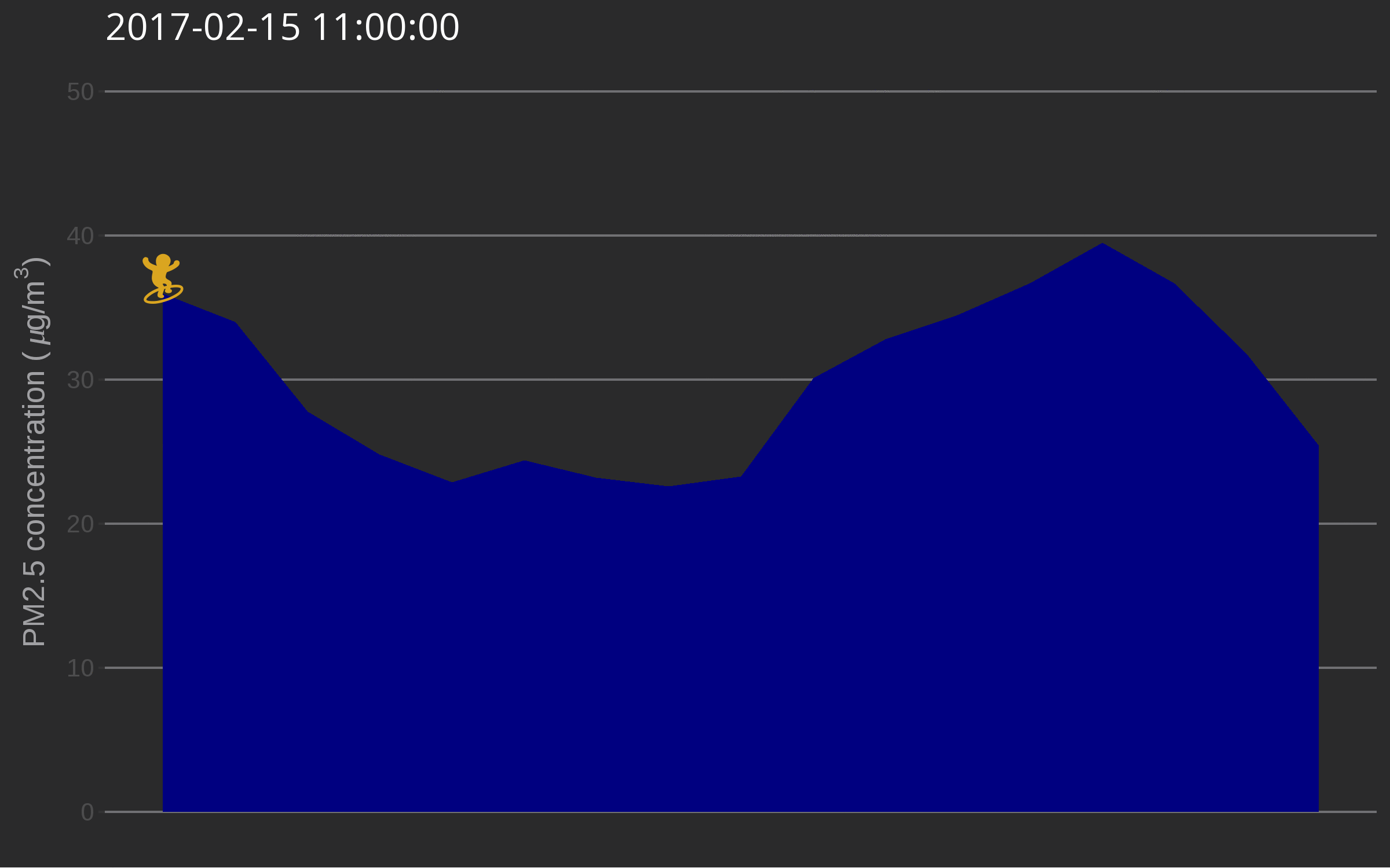
The use of such a plot might be to illustrate a very serious talk about the need for open air quality data. I promise you’ll get attention from the audience.
🔗 Fireworks across the US on the 4th of July
When looking at the time series of PM2.5 over years in say Delhi, one can see peaks corresponding to fireworks for celebrating Diwali. Last summer I decided to explore PM2.5 values on the 4th of July in the US.
First I got the necessary data.
# find how many measurements there are
first_test <- aq_measurements(country = "US",
                              has_geo = TRUE,
                              parameter = "pm25",
                              limit = 10000,
                              date_from = "2016-07-04",
                              date_to = "2016-07-06",
                              value_from = 0)
count <- attr(first_test, "meta")$found
print(count)
## [1] 25446
library("purrr")

# map queries over all pages
usdata <- (1:ceiling(count/10000)) %>%
  purrr::map(function(page){
    aq_measurements(country = "US",
                    has_geo = TRUE,
                    parameter = "pm25",
                    limit = 10000,
                    date_from = "2016-07-04",
                    date_to = "2016-07-06",
                    value_from = 0,
                    page = page)
    }) %>%
  bind_rows()
I then summarize it for having one value by hour only and replace values over 80 by 80, because otherwise it’s hard to find a good colour scale for the graph later.
usdata <- usdata %>%
  group_by(hour = update(dateUTC, minute = 0),
           location, longitude, latitude, dateUTC) %>%
  summarize(value = mean(value))

usdata <- usdata %>%
  ungroup() %>%
  mutate(hour = update(hour, hour = lubridate::hour(hour) - 5)) %>%
  mutate(value = ifelse(value > 80, 80, value))
save(usdata, file = "data/4th_july.RData")
This is how I make the visualization itself, using once again magick, and also albersusa. The package has to be installed from Github: devtools::install_github("hrbrmstr/albersusa"). Note that I don’t show Alaska and Hawaii.
load( "data/4th_july.RData")

mintime <- lubridate::ymd_hms("2016 07 04 17 00 00")
maxtime <- lubridate::ymd_hms("2016 07 05 07 00 00")

usdata <- filter(usdata, hour >= mintime)
usdata <- filter(usdata, hour <= maxtime)

library("albersusa")
us <- usa_composite()
us_map <- fortify(us, region="name")
us_map <- filter(us_map, !id %in% c("Alaska", "Hawaii"))
gg <- ggplot()
gg <- gg + geom_map(data=us_map, map=us_map,
                    aes(x=long, y=lat, map_id=id),
                    color="white", size=0.1, fill="black")
gg <- gg + theme_map(base_size = 40)
gg <- gg + theme(plot.title = element_text(color="white"))
gg <- gg + theme(legend.position = "bottom")
gg <- gg + theme(panel.background = element_rect(fill = "black"))
gg <- gg + theme(plot.background=element_rect(fill="black"))
gg <- gg + theme(legend.background= element_rect(fill="black", colour= NA))
gg <- gg + theme(legend.text = element_text(colour="white"))
gg <- gg + theme(legend.title = element_text(colour="white"))

# find the maximal number of data points for the period
lala <- group_by(usdata, location, latitude) %>% summarize(n = n())
# and keep only stations with data for each hour
usdata <- group_by(usdata, location, latitude) %>%
  filter(n() == max(lala$n),
         latitude < 50, longitude > - 130) %>%
  ungroup()

firework_onehour <- function(now, gg, usdata){
  p <- gg+
  geom_point(data = filter_(usdata, ~ hour == now),
             aes(x=longitude,
                  y =latitude,
                  colour = value,
                  size = value))+
    ggtitle(as.character(now)) +
  coord_map()+
  viridis::scale_color_viridis(expression(paste("PM2.5 concentration (", mu, "g/",m^3,")Set to 80 if >80")),
                               option = "inferno",
                               limits = c(min(usdata$value),
                                          max(usdata$value))) +
    scale_size(limits = c(min(usdata$value),
                                          max(usdata$value)))
outfil <- gsub("-", "", now)
  outfil <- gsub(" ", "", outfil)
  outfil <- gsub("[:punct:]", "", outfil)
  outfil <- paste0(outfil, "_fireworks.png")
  ggsave(outfil, p, width=12, height=6)

  outfil
}

sort(unique(usdata$hour)) %>%
  map(firework_onehour, gg = gg, usdata = usdata)  %>%
  map(image_read) %>%
  image_join() %>%
  image_animate(fps=1) %>%
  image_write("fireworks.gif")
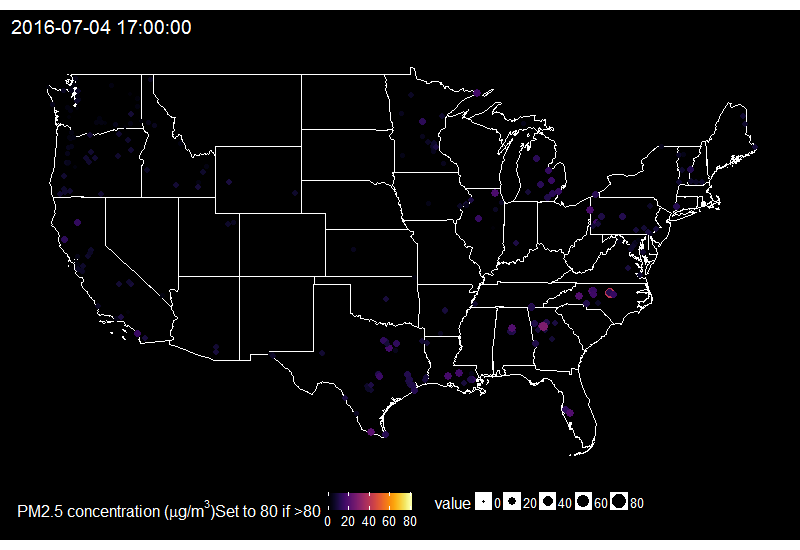
On this gif, where the title indicates the time in New York City, one sees the East to West wave of PM2.5 peaks due to fireworks as soon as it gets dark in each city, which happens at different times across the US. I think it’s an interesting way of looking at this holiday. Holidays and fireworks are one thing, but one could also imagine coupling ropenaq data with data about fires, or weather, for which rOpenSci got you covered with rnoaa (https://github.com/ropensci/rnoaa) and riem (https://github.com/ropensci/riem). Or for parts of the world with a high density of locations, why not compare air quality with land-use information from Openstreetmap via osmdata and with transit information processed via gtfsr?
🔗 Conclusion
🔗 What can YOU do?
I’d strongly encourage you to get involved with the open-source projects you think are useful and cool, and in particular with rOpenSci and OpenAQ since I know these are friendly places, which is even made official by Codes of conduct. Tweet at both organizations, look at their website, you’ll meet people who’ll be more than happy to include you and your contributions. All OpenAQ Github repos have contributing guides.
If you want to get involved with ropenaq itself, you’re welcome to do so! I’ve opened issues of possible enhancements of the package. Currently, two of them are I think more geared towards new-ish users of R that have an air quality background, one of them is more technical. And don’t hesitate to open an issue if you notice a bug or think of a new functionality! Also, I like to collect use cases of the package, feel free to share your ropenaq examples.
🔗 A few concluding words
Note that ropenaq isn’t the only R package providing access to open air quality data, you can have a look at:
The
rdefrapackage, also part of the rOpenSci project, allows to to interact with the UK AIR pollution database from DEFRA, including historical measures. I actually reviewed this package for rOpenSci, see the review here. I tried to be as nice and helpful as Andy and Andrew and think Claudia did an awesome work with her package!The
openairpackage, on top of the plotting tools appreciated by air quality folks, gives access to the same data asrdefrabut relies on a local and compressed copy of the data on servers at King’s College (UK), periodically updated.The
usaqmindiapackage provides data from the US air quality monitoring program in India for Delhi, Mumbai, Chennai, Hyderabad and Kolkata from 2013. I packaged it up for ease of use, the data is included in the package.
Thanks for reading until here! I also thank Stefanie Butland, Scott Chamberlain and Karthik Ram for their support during the preparation of this post.
Filed under
Suggest an edit
Open a pull request
