
Tuesday, February 15, 2022 From rOpenSci (https://ropensci.org/blog/2022/02/15/gghdr/). Except where otherwise noted, content on this site is licensed under the CC-BY license.
They may forget what you said, but they will never forget how you made them feel.
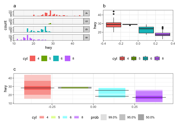
This was how being a newcomer to rOpenSci OzUnconf 2019 felt. It was incredible to be a part of such a diverse, welcoming and inclusive environment. I thought it would be fun to blog about how it all began, and the twists and turns we experienced along the way as we developed the gghdr package. The package provides tools for plotting highest density regions with ggplot2 and was inspired by the package hdrcde developed by Rob J Hyndman. The highest density region approach of summarizing a distribution is useful for analyzing multimodal distributions and can be composed of numerous disjoint subsets. For example, the histogram of the highway mileage (hwy) data from the mpg dataset (a) shows that cars with 6 cylinders (cyl) are bimodally distributed, which is reflected in the highest density region (HDR) boxplot (c) but not in the standard boxplot (b). Hence, we see that HDRs are useful in displaying multimodality in the distribution.
The other authors of this package include Mitchell O’Hara-Wild, Stephen Pearce, Ryo Nakagawara, Darya Vanichkina, Emi Tanaka, Thomas Fung and Rob J Hyndman.
Initiation
Since Rob’s paper describing highest density regions was written almost 25 years ago and the package came 15 years ago, the need to reexamine it through the ggplot2 lenses had been lurking around for a while. While I read the paper and attempted using hdrcde, it did feel less powerful not being able to use ggplot2 and the flexibilities that come along with it. Rob himself suggested it would be great to have a ggplot2 framework. I tried it but didn’t get a chance to put it all together. There was even a point where Mitch O’Hara-Wild was threatening me that he would get this done overnight if I didn’t (and I bet he would have had he not been raising chickens and bees)! But one fine day, he suggested that the rOpensci ozunconf could be the right place to do this together. I thought this was a brilliant idea as I had read about Nick Tierney’s experience earlier and was thrilled to be a part of it.
This event is quite different from other conferences in the sense that it is mostly invite-only, where past attendees can recommend new ones. Mitch was a participant at OzUnconf 2018, so he could invite me to work on this project with him at ozunconf 2019. Soon I had applied and we were accepted. Thanks go to the organizers of the ozunconf for the opportunity and excellent management of what has turned out to be a highly stimulating experience.
Planning and execution
Shortly after we were accepted, Mitch posted the idea on the rOpenSci Github issues page. Posting an issue like this is a great place to start a discussion on a rough idea or to learn more or comment on any idea that you find exciting. We brainstormed for a couple of days on how hdrcde worked and what potential functions and features we would like to have or improve in the new package. The discussion led to a workflow which pretty much looked like this:
Doing a bit of brainstorming on the project ahead of time helped us to set the expectations, and communicate them to potential team members. Although it is worth mentioning that projects don’t need to be fully fleshed out ahead of time - the ozunconf organisers strongly encourage working on projects that you thought of even on that very day.
Fast-forward to the first day of the conference! The participants had already suggested ideas (there were many brilliant ones) and then voting started for the projects people were excited to be associated with. Little did we know that time there would be more enthusiasts who would be as eager to contribute to this project and learn about ggplot2 internals (very aptly put by Mitch while advertising the project. Smart move mate)! Oh, and what a fun and collaborative team to work with!
At the end of the two days, we had established the following:
geom_hdr_boxplot()to replacehdr.boxplot()to calculate HDR boxplots in one dimension.
Before:
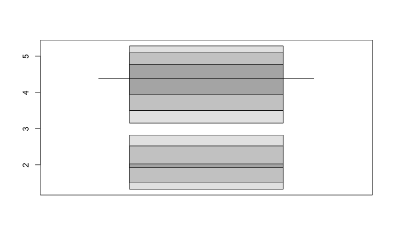
library(hdrcde)
hdr.boxplot(faithful$eruptions,
            prob = c(99, 95, 50),
            all.modes = FALSE)
After:
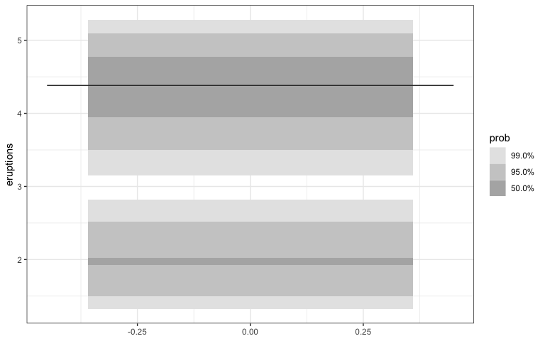
library(gghdr)
library(ggplot2)
ggplot(faithful, aes(y = eruptions)) +
  geom_hdr_boxplot(prob = c(0.5, 0.95, 0.99),
                   all.modes = FALSE)
- The interval bars in
hdr.den()to be replaced with a rug plot to display HDRs of 1d marginal distributions ingeom_hdr_rug().geom_density()could then be added to the resultant plot to get plots equivalent tohdr.den().
Before:
library(hdrcde)
hdr.den(faithful$eruptions,
        col = c("skyblue", "slateblue2", "slateblue4"))
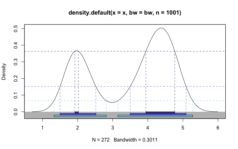
#> $hdr
#>         [,1]     [,2]     [,3]     [,4]
#> 99% 1.325006 2.819318 3.150488 5.281301
#> 95% 1.501086 2.520411 3.499998 5.090902
#> 50% 1.922811 2.023740 3.946274 4.769700
#>
#> $mode
#> [1] 4.379524
#>
#> $falpha
#>         1%         5%        50%
#> 0.06665753 0.15244145 0.36339705
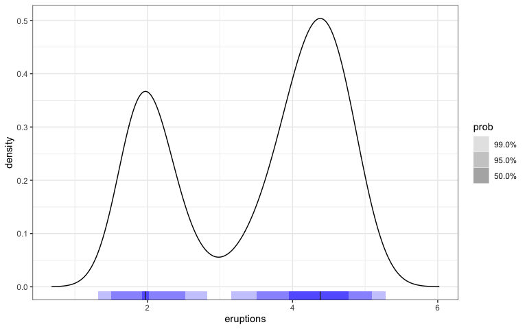
After:
library(gghdr)
library(ggplot2)
library(dplyr)
hdrc_bw <- hdrcde::hdrbw(faithful$eruptions, mean(c(0.5, 0.95, 0.99)))
faithful %>%
  ggplot(aes(x = eruptions)) +
  geom_density(n= 1001, bw = hdrc_bw) +
  geom_hdr_rug(fill=  "blue") +
  xlim(c(0.6833018, 6.0166982))
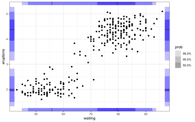
Also, the display of 1d marginal distributions for both variables could be a useful feature to have through geom_hdr_rug().
ggplot(faithful, aes(y = eruptions, x = waiting)) +
  geom_hdr_rug(sides = "trbl", fill = "blue") +
  geom_point()
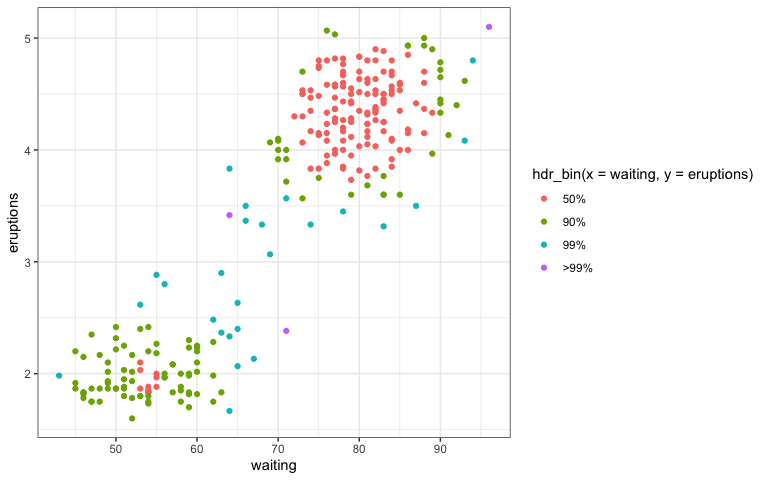
hdr_bin()to replacehdrscatterplot(). This would not be an independent geom, but rather a function to add in the aesthetic color with each color representing an HDR with a specified coverage.
Before:
hdrscatterplot(faithful$waiting,
               faithful$eruptions)
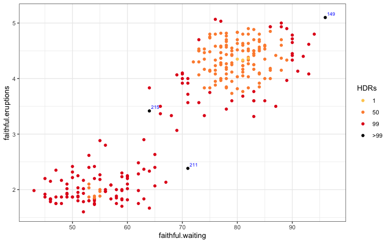
After:
ggplot(data = faithful,
       aes(x = waiting, y = eruptions)) +
  geom_point(aes(colour = hdr_bin(x = waiting,
                                  y = eruptions)))
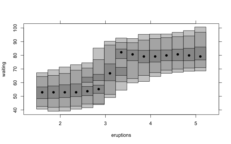
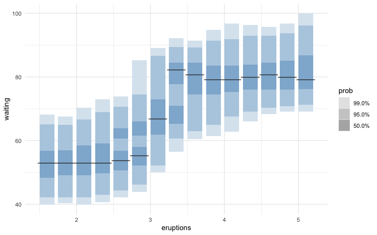
geom_hdr_boxplot()with bothxandyvariables to replacehdr.cde()which is used in HDRs for a conditional density estimate. Modes for the conditional density estimates are represented through lines instead of dots.
Before:
faithful.cde <- cde(faithful$eruptions, faithful$waiting)
plot(faithful.cde, plot.fn = "hdr",
     xlab = "eruptions", ylab = "waiting")
After:
ggplot(faithful, aes(x = eruptions, y = waiting)) +
    geom_hdr_boxplot(fill="steelblue") +
    theme_minimal()
We also deliberated on names of potential functions at the brainstorming stage which led to the idea of a package design collaboration corner.
Documentation, testing and illustrative followed along the way to make it CRAN ready.
Bottlenecks along the way
Now where there’s a will, there’s a way. Except that soon we could say where there is a merge, there is a conflict. While most times we use GitHub for code-sharing, publishing software and collaborating with our future self, this was the time to show how we collaborate with others. It took almost 2 hours with both GitKraken and Mitch helping us to deal with the merge conflicts!
Where to from here?
We still have one thing to do (replace the hdr.boxplot.2d() with geom_hdr_boxplot.2d(), which would calculate and plot HDRs in two dimensions), but are happy to announce that with some embellishments and review, the current version is on CRAN. Kudos team!! You can learn about our package gghdr at the package website, and the Github repo.
Filed under
Suggest an edit
Open a pull request
