
Tuesday, January 31, 2023 From rOpenSci (https://ropensci.org/blog/2023/01/31/dynamite-r-package/). Except where otherwise noted, content on this site is licensed under the CC-BY license.
🔗 Introduction
Panel data contains measurements from multiple subjects measured over multiple time points. Such data can be encountered in many social science applications such as when analysing register data or cohort studies (for example). Often the aim is to perform causal inference based on such observational data (instead of randomized control trials).
A new rOpensci-reviewed R package dynamite available on CRAN implements a new class of panel models called the Bayesian dynamic multivariate panel model (DMPM) which supports
- Joint modelling of multiple response variables potentially from mixed distributions (e.g. Gaussian and categorical responses)
- Time-varying regression coefficients modelled as splines
- Group-level random effects (coming soon)
- Probabilistic posterior predictive simulations for long-term causal effect estimation, including not only the average causal effects but the full interventional distributions of interest (i.e. the distribution of the response variable after an intervention).
The theory regarding the model and the subsequent causal effect estimation for panel data, with some examples, can be found in the SocArxiv preprint1 and the package vignette. In this post, I will illustrate the use of dynamite for causal inference in a non-panel setting (i.e. we have time series data on only a single “individual”).
The idea of the following example is similar to a synthetic control approach for time series causal inference, originally suggested by Abadie et al.2, and further extended and popularized by Brodersen et al.3 and their CausalImpact package.
The basic idea of the synthetic control method is that you have a time series of interest , for example daily sales of some product, and an intervention was made at some time point (e.g., change in the value-added tax, VAT). You would then like to know what was the effect of the intervention on . For example, by how much did the sales increase due to the decrease or removal of the VAT? Typically you also have one or more “control times series” which predict the behaviour of but for which the intervention has no affect (e.g. some time-varying properties of the product, the demographic variables of the market, or sales of the product in some other markets). You then build a statistical model for using the control series for the same time points, use your estimated model to predict the values of in the intervention period using the observed control series and compare these predictions to the observed values of (which experienced the intervention).
In the synthetic control approach one of the key assumptions is that the control series itself is not affected by the intervention. In the sales example above, using sales data of some distant market could be suitable control, but the change in VAT might have an effect on the sales in the neighboring markets as well, so using such a time series for the control would then violate this assumption. While applicable to valid synthetic control cases, the dynamite package can also be used in cases where not only the main response variable of interest (i.e. sales in the above example) but also the control series (sales of neighboring markets) are affected by the intervention. This is done by jointly modelling both the main response variable as well as the control time series (although it could be argued that they should not be called a ‘control’ series in this case).
🔗 Data generation
Load some packages:
library(dynamite)
library(dplyr)     # Data manipulation
library(ggplot2)   # Figures
library(patchwork) # Combining Figures
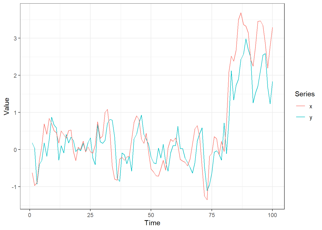
I will consider the following true data generating process (DGP):
for , where the initial values and are drawn from the standard normal distribution (in subsequent modelling we condition on these first observations, i.e. they are treated as fixed data).
Variable is our intervention variable, which I fixed to zero for the first 80 time points, and to one for the the last 20 time points, i.e. the intervention starts at time . Following the terminology in our DMPM paper1, this is a recurring intervention, in contrast to an atomic intervention where and zero otherwise. Naturally it would be possible to also consider interventions such as for and otherwise (e.g. an ad campaign starts at time 81 and ends at time 89).
Our hypothetical research question is how does affect ? Looking at our data generating process it is clear that does not affect , but it still affects via Note that I chose this model just to exemplify the modelling, and these coefficients clearly do not reflect the sales example in the introduction.
I will first simulate some data according to our true model:
set.seed(1)
n <- 100
x <- y <- numeric(n)
z <- rep(0:1, times = c(80, 20))
x[1] <- rnorm(1)
y[1] <- rnorm(1)
for(i in 2:n) {
    x[i] <- rnorm(1, -0.5 * y[i-1] + x[i-1] + z[i], 0.3)
    y[i] <- rnorm(1, 0.7 * x[i-1], 0.3)
}
d <- data.frame(y = y, x = x, z = z, time = 1:n)
ggplot(d, aes(time)) +
    geom_line(aes(y = y, colour = "y")) +
    geom_line(aes(y = x, colour = "x")) +
    scale_colour_discrete("Series") +
    ylab("Value") + xlab("Time") +
    theme_bw()
🔗 Causal inference based on synthetic control with dynamite
While in the data generation the variable did not depend on the lagged value and , I will nevertheless estimate a model where both and depend on the and , as well as , mimicking the fact that I’m not sure about the true causal graph (structure of DGP).
The model formula for the main function of the package, dynamite(), is defined by calling a special function obs() once for each “channel”, i.e. response variable.
The lagged variables can be defined in the formula as lag(y), but here I use a special function lags() which by default adds lagged values of all channels to each channel:
f <- obs(y ~ z, family = "gaussian") + obs(x ~ z, family = "gaussian") + lags()
## same as
# f <- obs(y ~ z + lag(y) + lag(x), "gaussian) +
#   obs(x ~ z + lag(y) + lag(x), "gaussian)
We can now estimate our model with dynamite() for which we need to define the data, the variable in the data defining the time index (argument time), and the grouping variable (argument group), which can be ignored in this univariate case:
fit <- dynamite(f,
  data = d,
  time = "time",
  chains = 4, cores = 4, refresh = 0, seed = 1)
Compiling Stan model.
The actual estimation is delegated to Stan using either rstan (default) or cmdstanr backends.
The last arguments are passed to rstan::sampling() which runs the Markov chain Monte Carlo for us.
While rstan is the default backend as it is available at CRAN, we recommend the often more efficient cmdstanr or the latest development version of rstan, available at Stan’s repo for R packages.
Let’s see some results:
options(width = 90) # expand the width so that the column names are not cut off
fit
Model:
  Family   Formula
y gaussian y ~ z
x gaussian x ~ z

Lagged responses added as predictors with: k = 1
Data: d (Number of observations: 198)
Grouping variable: .group (Number of groups: 1)
Time index variable: time (Number of time points: 100)

Smallest bulk-ESS: 2259 (beta_y_x_lag1)
Smallest tail-ESS: 2353 (beta_y_x_lag1)
Largest Rhat: 1.003 (beta_x_z)

Elapsed time (seconds):
        warmup sample
chain:1  5.544  5.377
chain:2  4.979  4.286
chain:3  5.295  5.501
chain:4  4.693  5.600

Summary statistics of the time-invariant parameters:
# A tibble: 10 × 10
   variable          mean   median     sd    mad      q5     q95  rhat ess_bulk ess_tail
   <chr>            <dbl>    <dbl>  <dbl>  <dbl>   <dbl>   <dbl> <dbl>    <dbl>    <dbl>
 1 alpha_x        0.0115   0.0114  0.0320 0.0325 -0.0416  0.0652  1.00    5866.    2920.
 2 alpha_y       -0.00536 -0.00514 0.0322 0.0317 -0.0574  0.0483  1.00    5476.    2733.
 3 beta_x_x_lag1  0.989    0.988   0.0573 0.0557  0.897   1.08    1.00    2362.    2566.
 4 beta_x_y_lag1 -0.572   -0.572   0.0683 0.0682 -0.685  -0.458   1.00    3211.    3189.
 5 beta_x_z       1.22     1.22    0.141  0.139   0.991   1.46    1.00    3166.    3016.
 6 beta_y_x_lag1  0.656    0.657   0.0614 0.0637  0.556   0.757   1.00    2259.    2353.
 7 beta_y_y_lag1  0.0837   0.0839  0.0706 0.0690 -0.0341  0.197   1.00    2682.    2559.
 8 beta_y_z      -0.0115  -0.0120  0.148  0.144  -0.253   0.236   1.00    3186.    2381.
 9 sigma_x        0.278    0.277   0.0201 0.0202  0.247   0.313   1.00    3508.    2605.
10 sigma_y        0.290    0.289   0.0209 0.0205  0.258   0.326   1.00    3874.    3218.
The coefficient estimates are pretty much in line with the data generation, but notice the relatively large posterior standard errors of the coefficients related to ; this is due to the fact that we have only a single series and single changepoint at time .
We can now perform some posterior predictive checks. First, we can check how well the posterior samples of our one-step-ahead predictions match with the observations by using the fitted() method and visualizing these posterior predictive distributions (I’ll one plot the estimates for the variable for simplicity):
out <- fitted(fit) |>
  group_by(time) |>
  summarise(
    mean = mean(y_fitted),
    lwr80 = quantile(y_fitted, 0.1, na.rm = TRUE), # na.rm as t = 1 is fixed
    upr80 = quantile(y_fitted, 0.9, na.rm = TRUE),
    lwr95 = quantile(y_fitted, 0.025, na.rm = TRUE),
    upr95 = quantile(y_fitted, 0.975, na.rm = TRUE))
ggplot(out, aes(time, mean)) +
  geom_ribbon(aes(ymin = lwr95, ymax = upr95), alpha = 0.3, fill = "#ED3535") +
  geom_ribbon(aes(ymin = lwr80, ymax = upr80), alpha = 0.3, fill = "#ED3535") +
  geom_line(colour = "#ED3535") +
  geom_line(data = d, aes(y = y), colour = "black") +
  xlab("Time") + ylab("Value") +
  theme_bw()
Warning: Removed 1 row(s) containing missing values (geom_path).
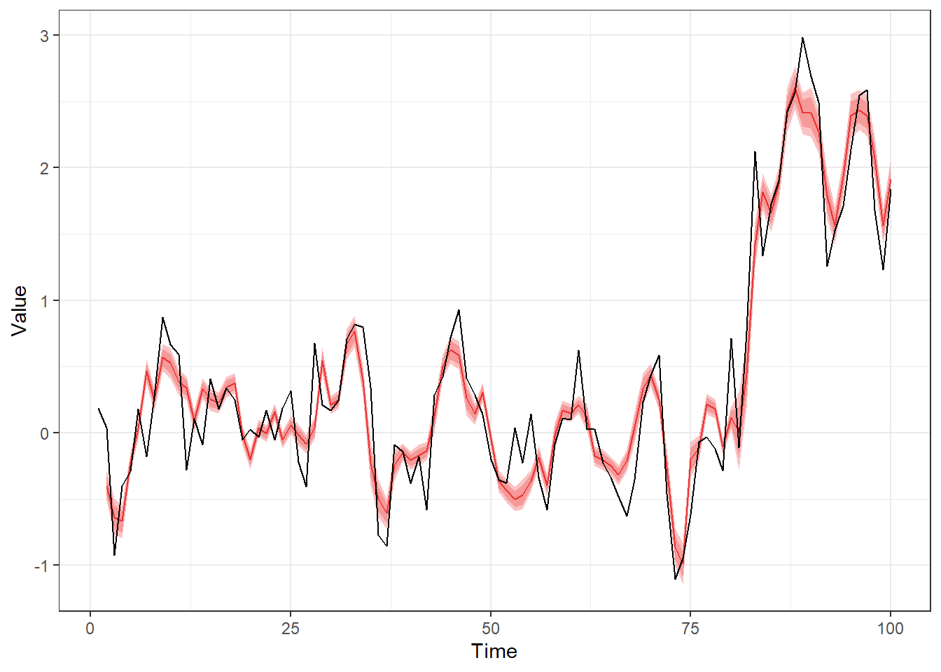
Note that these are not real out-of-sample predictions as the posterior samples of model parameters used for these predictions are based on all our observations, which would be especially problematic for a model containing time-varying components (e.g., splines). A more “honest” (and time consuming) approach would be to use approximate leave-future-out cross-validation via dynamite’s lfo() function.
Given the posterior samples of the model parameters, I can also make some counterfactual predictions (how would have looked like if no intervention was made, i.e. if was zero for all ). First I create a new data frame where for all time points, and where and are set to missing values starting from (the time point where started our intervention ):
newdata <- d
newdata$z <- 0
newdata$y[81:100] <- NA
newdata$x[81:100] <- NA
I then input this new data to the predict() method and define that I want posterior samples of expected values instead of new observations by using type = "mean" (new observations are still simulated behind the scenes in order to move forward in time):
pred <- predict(fit, newdata = newdata, type = "mean") |>
  filter(time > 80)
head(pred)
       y_mean      x_mean .group time .draw z  y  x
1  0.04691573 -0.40116363      1   81     1 0 NA NA
2 -0.44723418 -0.87026782      1   82     1 0 NA NA
3 -0.28467017 -0.38001229      1   83     1 0 NA NA
4 -0.36577537 -0.45640698      1   84     1 0 NA NA
5  0.01759079  0.01213885      1   85     1 0 NA NA
6  0.10382535  0.12547867      1   86     1 0 NA NA
From these I compute the posterior mean, 80% and 95% intervals for each time point:
sumr <- pred |>
  group_by(time) |>
  summarise(
    mean = mean(y_mean),
    lwr80 = quantile(y_mean, 0.1),
    upr80 = quantile(y_mean, 0.9),
    lwr95 = quantile(y_mean, 0.025),
    upr95 = quantile(y_mean, 0.975))
And some figures, following similar visualization style as popularized by the CausalImpact package, consisting of the actual predictions, difference compared to observed values, and cumulative differences of these:
p1 <- ggplot(sumr, aes(time, mean)) +
  geom_ribbon(aes(ymin = lwr95, ymax = upr95), alpha = 0.3, fill = "#ED3535") +
  geom_ribbon(aes(ymin = lwr80, ymax = upr80), alpha = 0.3, fill = "#ED3535") +
  geom_line(colour = "#ED3535") +
  geom_line(data = d, aes(y = y), colour = "black") +
  xlab("Time") + ylab("Value") +
  theme_bw()

sumr$y_obs <- y[81:100]
p2 <- sumr |>
  mutate(
    y_obs_diff = y_obs - mean,
    lwr_diff80 = y_obs - lwr80,
    upr_diff80 = y_obs - upr80,
    lwr_diff95 = y_obs - lwr95,
    upr_diff95 = y_obs - upr95
  ) |>
  ggplot(aes(time, y_obs_diff)) +
  geom_ribbon(aes(ymin = lwr_diff95, ymax = upr_diff95),
    alpha = 0.3, fill = "#ED3535") +
  geom_ribbon(aes(ymin = lwr_diff80, ymax = upr_diff80),
    alpha = 0.3, fill = "#ED3535") +
  geom_line(colour = "#ED3535") +
  xlab("Time") + ylab("Predicted value - observed value") +
  theme_bw()

cs_sumr <- pred |>
  group_by(.draw) |>
  summarise(
    cs = cumsum(d$y[81:n] - y_mean), across()) |>
  group_by(time) |>
  summarise(mean = mean(cs),
    lwr = quantile(cs, 0.025, na.rm = TRUE),
    upr = quantile(cs, 0.975, na.rm = TRUE))
`summarise()` has grouped output by '.draw'. You can override using the `.groups`
argument.
p3 <- ggplot(cs_sumr, aes(time, mean)) +
  geom_ribbon(aes(ymin = lwr, ymax = upr), alpha = 0.3, fill = "#ED3535") +
  geom_line(colour = "#ED3535") +
  xlab("Time") +
  ylab("Cumulative difference") +
  theme_bw()
p1 + p2 + p3 + plot_layout(ncol = 1)
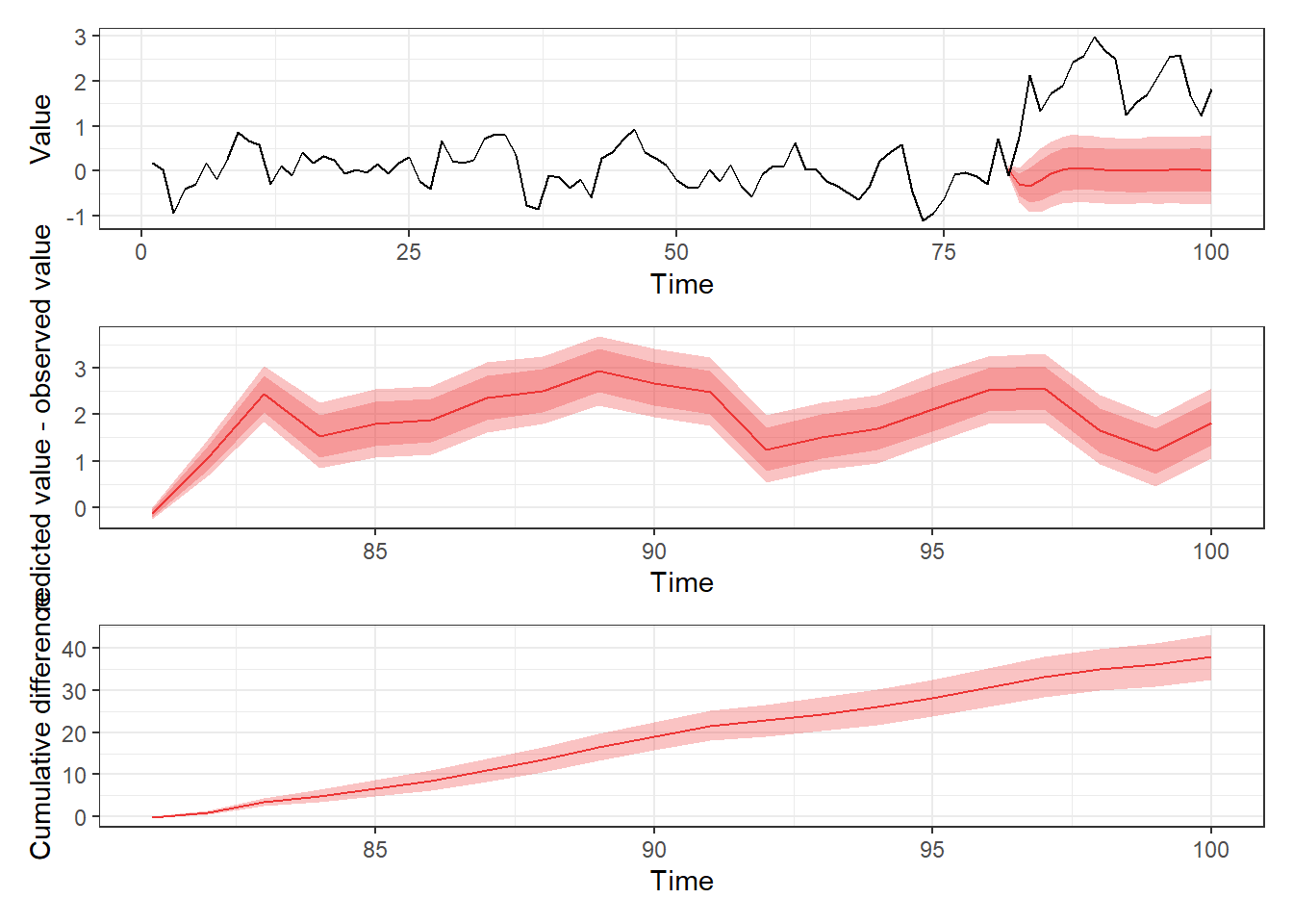
In the top figure, we see the predictions for the counterfactual case where no intervention was done ( for all ; pink ribbon/red line), whereas in the middle figure I have drawn the difference between predicted values and the actual observations for times , which show clear effect of intervention (the difference between between observations and predictions do not fluctuate around zero). In the bottom figure we see the cumulative difference between observations and our predictions, which emphasizes how the cumulative effect keeps increasing during the whole study period instead of tapering off or disappearing completely.
Finally we can consider a case where we assume that the intervention affects only a single response variable, , and does not depend on , Which, since we created this data, we know would be incorrect. This is essentially same as treating as exogenous and estimating a single-response model for . But in our case we can also proceed with our original model, and just modify the previous simulation so that the variable is fixed to its observed values:
newdata <- d
newdata$z <- 0
newdata$y[81:100] <- NA
pred_fixed_x <- predict(fit, newdata = newdata, type = "mean") |>
  filter(time > 80)
sumr_fixed_x <- pred_fixed_x |>
  group_by(time) |>
  summarise(
    mean = mean(y_mean),
    lwr80 = quantile(y_mean, 0.1),
    upr80 = quantile(y_mean, 0.9),
    lwr95 = quantile(y_mean, 0.025),
    upr95 = quantile(y_mean, 0.975))

p1 <- ggplot(sumr_fixed_x, aes(time, mean)) +
  geom_ribbon(aes(ymin = lwr95, ymax = upr95), alpha = 0.3, fill = "#ED3535") +
  geom_ribbon(aes(ymin = lwr80, ymax = upr80), alpha = 0.3, fill = "#ED3535") +
  geom_line(colour = "#ED3535") +
  geom_line(data = d, aes(y = y), colour = "black") +
  xlab("Time") + ylab("Value") +
  theme_bw()

sumr_fixed_x$y_obs <- y[81:100]
p2 <- sumr_fixed_x |>
mutate(
    y_obs_diff = y_obs - mean,
    lwr_diff80 = y_obs - lwr80,
    upr_diff80 = y_obs - upr80,
    lwr_diff95 = y_obs - lwr95,
    upr_diff95 = y_obs - upr95
  ) |>
  ggplot(aes(time, y_obs_diff)) +
  geom_ribbon(aes(ymin = lwr_diff95, ymax = upr_diff95),
    alpha = 0.3, fill = "#ED3535") +
  geom_ribbon(aes(ymin = lwr_diff80, ymax = upr_diff80),
    alpha = 0.3, fill = "#ED3535") +
  geom_line(colour = "#ED3535") +
  xlab("Time") + ylab("Predicted value - observed value") +
  theme_bw()

cs_sumr_fixed_x <- pred_fixed_x |>
  group_by(.draw) |>
  summarise(
    cs = cumsum(d$y[81:n] - y_mean), across()) |>
  group_by(time) |>
  summarise(mean = mean(cs),
    lwr = quantile(cs, 0.025, na.rm = TRUE),
    upr = quantile(cs, 0.975, na.rm = TRUE))
`summarise()` has grouped output by '.draw'. You can override using the `.groups`
argument.
p3 <- ggplot(cs_sumr_fixed_x, aes(time, mean)) +
  geom_ribbon(aes(ymin = lwr, ymax = upr), alpha = 0.3, fill = "#ED3535") +
  geom_line(colour = "#ED3535") +
  xlab("Time") +
  ylab("Cumulative difference") +
  theme_bw()
p1 + p2 + p3 + plot_layout(ncol = 1)
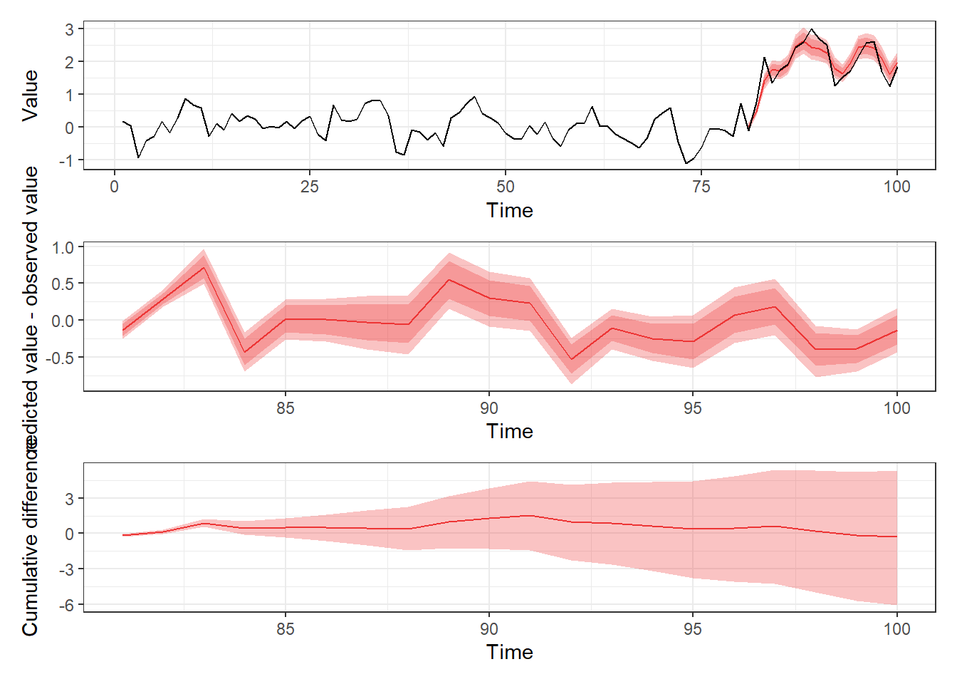
As expected, because we treated variable as fixed, and the intervention only affects only via , we see that the counterfactual predictions and the observed series are very similar and would (incorrecly) conclude that our original intervention did not affect . Therefore, by using the dynamite package to model multiple response variables we are able to capture patterns we would have otherwise missed.
🔗 Future directions
In future, we plan to add more distributions such as Weibull, multinomial, and -distribution for the response variables and improve the tools for visualization of the model parameters and predictions. We would also be very interested in hearing how the package is used in various applications, especially if you can share your data openly. Pull requests and other contributions are very welcome.
🔗 Acknowledgements
The package was created by Santtu Tikka and Jouni Helske as part of PREDLIFE project, funded by the Academy of Finland. The package was reviewed by Nicholas Clark and Lucy D’Agostino McGowan.
Helske J, Tikka S (2022). Estimating Causal Effects from Panel Data with Dynamic Multivariate Panel Models. SocArxiv Preprint. doi.org/10.31235/osf.io/mdwu5. ↩︎ ↩︎
Abadie, A, Gardeazabal, J (2003). The Economic Costs of Conflict: A Case Study of the Basque Country. The American Economic Review, 93(1), 113–132. doi.org/10.1257/000282803321455188 ↩︎
Brodersen KH, Gallusser F, Koehler J, Remy N, and Scott SL (2015). Annals of Applied Statistics. Inferring causal impact using Bayesian structural time-series models. doi.org/10.1214/14-AOAS788 ↩︎
Filed under
Suggest an edit
Open a pull request
