
Thursday, September 11, 2025 From rOpenSci (https://ropensci.org/blog/2025/09/11/repometrics-call-help/). Except where otherwise noted, content on this site is licensed under the CC-BY license.
We at rOpenSci are developing an organizational dashboard to provide an overview of all rOpenSci code contributors and their repositories. We are seeking feedback and suggestions on an initial prototype dashboard.
We have developed a prototype dashboard which aims to help organizations maintain complex systems of inter-dependent software components. Our initial prototype organizational dashboard provides insights into code contributors, their repositories, and maintenance status and needs. The prototype dashboard shows data for the three related GitHub organizations, reconhub, epiverse, and epiverse-trace, all of which develop and host open-source software for understanding and analysing epidemics. We aim to develop the current prototype as a template for adoption and adaptation by other open-source organizations.
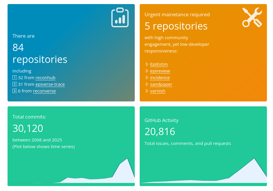
Organizational overview sections from main prototype dashboard page.
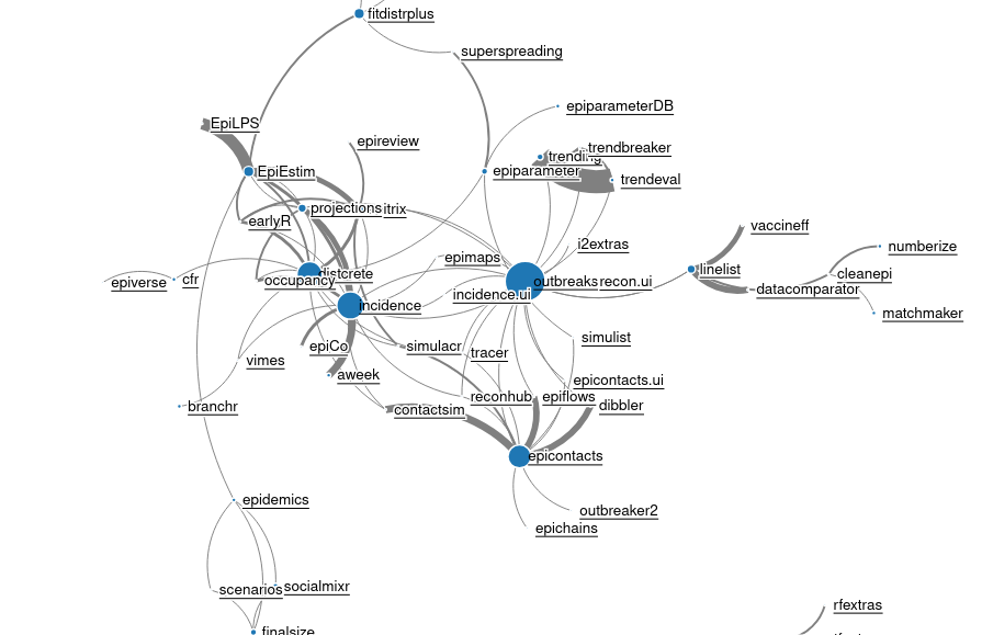
Interactive network diagram connecting packages in the organization.
The primary aim of the dashboard is to help all people involved with, or interested in, either those epidemic-related organizations or rOpenSci, through providing an organization-wide overview of the state of code repositories and the community activity which sustains them.
🔗 Help design and develop our dashboard!
We are seeking help in the further design and development of our prototype organizational dashboard, both for the organizations featured there, and more generally for a planned rOpenSci-wide dashboard. You can help us by providing suggestions for any ways you think the prototype organizational dashboard could be improved. If you’re a contributor to, or maintainer of, an R package, we’d particularly like to hear about any ways the dashboard could be made more useful for you. Please make comments either in this blog post, or via or discussions in the associated GitHub repository. Want to give private feedback? No worries, email me directly.
🔗 A few notes
- The dashboard is built on a huge wealth of data, so presume any data you can think of from full git logs and GitHub APIs are already there and could be used.
- Those data include time series of most things measured, even though many are only presented as snapshots of the latest time period.
- Given those 2 points, the biggest challenge is reducing these data to some minimally meaningful amount.
🔗 Thank you!
Thank you! Interested in contributing in other ways to rOpenSci? Please have a look at our contributing guide.
Filed under
Suggest an edit
Open a pull request
